Showing posts with label Internet. Show all posts

Wednesday, 20 December 2017

A brand-eye view of the internet in real time


 Our Digitally Connected World Captured
If you’re looking for evidence that the world of commerce has changed, just spend a minute mesmerized by a real-time representation of some of what’s happening on the web.
In the time it takes to read this post there will be more than 5 million likes on Facebook and 3 million posts on Instagram. As these once strictly social platforms become woven into the way consumers engage with, converse with and purchase from brands the importance of how brands then master these platforms as part of the way they do business becomes more and more important.


I was talking just last week with my friend Nelly who is a fashion marketing guru about the increasingly influential role micro influencers are playing in that category. These are social media influencers with a very targetted, very loyal and very engaged community of 2,000 to 20,000 like-minded people. A single post by one of these micro influencers on Facebook, Instagram, Pinterest, Youtube or Twitter can have a bigger impact than a small marketing campaign – and by impact, we’re talking online purchases. Here are two articles we wrote on micro-influencers: The Big News on Influencer Marketing Is – Think Small – and – Why Micro-Influencers are Every Brands Best Friend.


The more activity there is on these platforms, the greater the need for brands to think micro/local/super targeted. Small brands and start-ups have a natural advantage over large brands here as they tend to have this micro-mindset as part of their DNA.


Click on this link to get a detailed view of the counters in real time. By rolling over each panel you get another layer of interesting, real time info on each channel: Betfy.co.uk


Source

Sunday, 17 December 2017

Why It’s Time To Say Goodbye To “The Fold” In Email Marketing


Before the rise of the Internet and everything mobile (now up to 56% of opens in September), the news used to take time. We’d have our coffee and read the paper page by page. And we knew exactly what to focus on: what was above the fold. That’s where the biggest stories broke each day. If you weren’t sure you wanted to buy the paper, what was above the fold would also serve to entice you to buy, since most newsstands displayed them like so:


Source: New York Times
Now, the news is instant and 24/7, sometimes in as few as 140 characters. Even though the sight of an actual newspaper may be foreign to many cellphone-happy millennials, the term “the fold” has stuck around. For email and web design alike, “above the fold,” is still used to indicate relative importance—and also acknowledges the shrinking attention spans of readers today.
For email marketers, the fold has been a longstanding concern, whether that’s trying to optimize emails to render correctly in Outlook’s preview pane or for newer preview functionality like that in Inbox by Gmail. Marketers know they only have a short amount of time to grab the reader, which made “the fold” a clear demarcating line.
Because of widespread belief that attention spans have shortened and that people don’t read, marketers became obsessed with cramming their important information and CTA above the fold. But scrolling is actually easier than clicking, and subscribers come to expect it. While you can still lead with your most important content, you no longer have to. We’re here to debunk once and for all the idea of “the fold” in email.

SAY GOODBYE TO THE FOLD, HELLO TO “THE SCROLL”

According to Alex Williams, VP & Creative Director at Trendline (and a speaker at Litmus Live in 2016), mobile also has a fold: it’s called the “scroll.”
What does this mean?
Above the scroll means that you have to entice your reader to scroll down—show them why they should read your email in its entirety—by providing compelling and memorable content up top. The goal is to set expectations that your content will be relevant and interesting all the way down the email, and to be memorable right away, thus initiating the scroll.

See the full email on Litmus Scope.
In the above example from one of my favorite daily newsletters, theSkimm, you can see they don’t lead with the most important piece of information (well, #Hiddleswift was kind of a big deal). Instead, they break each section of the email into sections, just like a newspaper.
SUBSCRIBERS THAT DIDN’T CLICK ON YOUR HERO IMAGE, BUT ARE STILL SCROLLING, ARE BIG OPPORTUNITIES. —ALEX WILLIAMS
Because the information is relevant and easy to understand, they’re counting on subscribers scrolling all the way to the bottom, rather than clicking on the first piece of content without reading anything else.

USE THE ENVELOPE TO TEASE YOUR CONTENT

Back in the days of print marketing, the envelope was key to that first step in subscriber engagement: the open. Known as the Johnson Box, this gave mail recipients a window into your mail offer. Designed to draw the reader’s attention to the key message, it also served as a way to entice readers to open the letter—just like the subject line and preheader text in email today.
Regardless of the type of email you’re sending, initiating a scroll starts as early as the envelope in your email’s subject line and preheader text. Experiment with teasing an article in your subject line or preheader text that isn’t found until lower in the email. This can build up anticipation to get to the reason the subscriber opened the email in the first place.

See the full email on Litmus Scope.
In this example from TrackMaven’s newsletter, the content from the subject line (“35 Top Twitter Chats,”) isn’t shown until below the fold. Instead, they lead with top news stories from the past week. The top content is still relevant (and since they include it in every newsletter, expected), but to get to the content teased in the subject line, you need to scroll.

DIFFERENT EMAILS, DIFFERENT GOALS

However, this doesn’t mean “the fold” is completely useless. As with most things in email, the answer is: “it depends.”
When it comes to promotional email, marketers tend to send out three different categories, which relates to the three main areas of the marketing funnel:
  • Awareness emails can take a variety of forms, but in general, they introduce the subscriber to something new, such as a blog post or infographic. The goal of these emails isn’t necessarily to sign up or buy your product but to increase familiarity and encourage people to visit your website. They may already be aware of your company (after all, they did give you an email address), but not everything about what you do or what you stand for. Awareness emails are about content consumption, which is a one-way interaction.
  • Engagement emails build that 1:1 relationship with the subscriber, sometimes with personalization, recommendations, or an ask for feedback. This could take the form of a welcome email, survey request, sales outreach, gated ebook, or an email like our TEDC ‘16 tickets on sale email that encouraged folks to interact with with the email more deeply. Engagement emails ask for more than reading a piece of content. They’re about building a relationship, which requires two-way interaction.
  • Conversion emails focus on completing a sale or purchase. This may be advertising a promotion, re-engaging the list, or asking for signups for a webinar. The ask and goal of the email is clear.
(Want to brush up on your definition of conversion? This article talks through exactly what it means.)
Each type of email requires a different mindset because you’re asking for a different level of commitment on the part of the subscriber. When you set your goals for your campaigns, enticing the scroll makes sense for some categories but not for others.

AWARENESS EMAILS

Awareness emails buy time, rather than buy clicks. How can you get your subscriber to keep reading for two more seconds, and then two more after that? The more they read or see, the higher the chance there is of something happening. Make your awareness emails creative, interesting, and above all, incomplete.
That doesn’t mean leaving the subscriber completely hanging or not finishing a sentence. It means keeping the curiosity gap high at all points in an email, so that they’re constantly wondering, “What’s next?” and satisfying them at each scroll.

See the full email on Litmus Scope.
The copy at the top of the email makes it super clear that the subscriber needs to scroll to see more winter coat options. Boom. Curiosity gap.

See the full email on Litmus Scope.
This product update from Trello doesn’t shy away from showing multiple pieces of news or completely different calls-to-action. The idea is to make people aware of new features, not sell them (though some of those features might require a plan upgrade).

See the full email on Litmus Scope.
This email doesn’t have a sale or promotion until the very bottom. Instead, the focus is on re-engagement and awareness—hey, here’s what you might be missing!

ENGAGEMENT EMAILS

Engagement emails start the conversation with your subscribers in a deeper way than awareness or conversion. They’re to be used sparingly, as they can be incredibly powerful.
To promote Litmus Live 2016, we decided to gamify our email to build excitement, increase engagement, and have a little fun. To reveal our third city, users sent in guesses via Twitter, which then populated a dynamic Twitter “collage” at the bottom of the email itself. We expected it to take 3-4 hours to get 500 shares using the hashtag #TEDC16. (Read why our new hashtag is #LitmusLive here, short version: politics.)
We were blown away 90 minutes later when we hit the mark! Our audience relished the opportunity to engage with us. The entire email worked together to reveal the city and encouraged subscribers to open the email again and again for updates. This completely flips the idea of a “fold” on its head, since our subscribers checked the email continuously to see new Twitter feed updates.

CONVERSION EMAILS

Conversion emails are usually short and to the point, with one ask, so it’s completely clear to the subscriber what action you want them to take. It might be a sales promotion, but it might not. Whether you’re focusing on buying a product or encouraging them to read an article, conversion emails focus on getting the click.
Because of their direct nature, conversion emails often benefit from having the CTA above the scroll to close the deal. It’s fine to include more options after the “scroll,” but those should be more opportunities for them to learn about that same one objective.


See the full email on Litmus Scope
In this example, General Assembly is clear about what action the reader should take: request a syllabus to learn more about their digital marketing class. The objective is clear, to the point, and there’s no need to scroll—you can’t miss that big red button.

See the full email on Litmus Scope.
This email is a great example of how to focus on exactly what you want your subscriber to do in the top section of your email, but still, include information below for those who do want to scroll. It’s clear what action they want you to take.

DON’T DESIGN EMAILS IN A VACUUM

REMEMBER, YOUR MOST IMPORTANT JOB AS AN EMAIL DESIGNER IS TO GET THEM TO OPEN THE NEXT ONE. —ALEX WILLIAMS
When you design emails, you have to think about the overall subscriber journey. Each email isn’t independent—every awareness email you send can ultimately contribute to that purchase when a subscriber does receive a conversion email.
The most important thing to remember about the scroll? Set up expectations as a brand that provides compelling enough content that subscribers will want to scroll—and keep scrolling.

Wednesday, 13 December 2017

Five Strategies to Generate Leads Through Mobile Marketing


THE influence of internet in our everyday lives is undeniable, but the role of mobile devices is just as impressive, having in mind the fact that the study shows the mobile has urged 70% of US-based companies to transform their business and user experience.


Hence the rise of mobile marketing, as a branch of marketing focused on promotion and customer acquisition through mobile devices. Mobile marketing requires creating seamless user experience by optimizing your website and thinking about responsive design, and this has become one of the most important tasks companies have to focus on.
As a company representative, you are already aware of how leveraging your presence online is important, but here are some strategies to help you generate leads through mobile marketing.

Simple call-to-actions

When creating call-to-actions (CTAs) you should have in mind that mobile devices will load the page differently, and this will affect user experience. Instead of going overboard with the design and creating content-rich landing pages, try to keep it simple. Simpler design of the landing page on a mobile device has proven to be more effective, as the screen itself is much smaller than a computer screen. Therefore, provide the necessary information only, and pay attention to the CTA button. Make sure it is large enough for users to tap on, and make sure the text on the button is not too long, as otherwise, the users might have difficulties reading it.

Optimized content for mobile devices

When thinking about mobile optimization, you should start by analyzing the behavior of mobile users. The users reach for their mobile device when they need specific information, and they need the answer fast. Regardless if they are waiting for a bus or at the dentists’, the users usually have a couple of minutes to find the information they need. It is also known that mobile users are very impatient, which means that they will wait a couple of seconds for a page to load before they quit the page. Finally, most mobile users will not bother themselves going through the entire content on the page, rather they would only scan the text in order to find the information they need.
This pattern in user behavior helps you determine what optimized content for mobile devices means – it is simple, fast, and it provides useful information. Make sure the page is not heavily populated with content, banners, and other possible distractions, as users will prefer simpler design. Use headings, highlight the key points of the text and make sure your content is easy to digest. All of this, compiled with fast and responsive page creates positive user experience and helps you generate leads.

Clickable phone number

As opposed to PC consumers, mobile users are likely to take action. For example, if a user is searching for the best coffee in town on the mobile device, this usually means that the person is planning to have coffee in the next hour or two. The same goes for other brands or industries, users need information about a product or service quickly, as they are going to take action.
This is the reason why you should make your phone number clickable. When the user visits your website and finds the information he needs, you should make it easier for him to reach you by allowing him to tap on the phone number and instantly call you. Otherwise, the user will have to copy and paste the phone number, or even memorize it in order to be able to dial it. This takes much more time and effort, and time is something which most mobile users are not willing to waste. User being ready to get in touch with you is the user who is most likely to become your customer, which is why you should consider this as a great opportunity to generate a lead.

Progressive profiling

Progressive profiling is a technique used with form filling, where the system gradually collects information and learns about user preferences. This means that you can keep your forms short, as you avoid repeating the questions. Even though you might be tempted to learn as much about the consumer through all sorts of questions, it is known for a fact that the shorter forms have much better conversion rate. Using this type of forms, you can add a couple of new questions each time, as the system already gathers the data from the previously filled in form.
In the same time, learning more about the user preferences helps you deliver more personalized experience and thus provide relevant content, which is more likely to convert and help with lead generation.

Coupons and discounts

Coupons are a well-known strategy in lead generation, and expansion to the mobile market has simply transferred the platform through which the coupons are redeemed. Businesses have been very creative with strategies to use mobile devices to promote their business and generate leads. Some of them offer coupon codes or loyalty discounts, while other businesses give away something in return for a check-in, like, or review on social media. Therefore, a diner might be offering a free milkshake for the users who check in using Foursquare, as they know this will help with boosting the exposure on this social network. Mobile users have a habit of browsing the social networks for recommendations, suggestions and information about the places they wish to visit. Business can leverage this opportunity and offer bonuses, gifts or discounts for those users who post reviews or ratings on social media. User reviews are known to be much more effective than ads.
Coupons and discounts are always a win-win strategy for both parties. Consumers get more value for their investment, while companies drive different actions on social media spreading the reach and brand awareness while at the same time making their products more fun and approachable.
In the end, it all comes down to understanding your business, its demands and opportunities, because this is what helps you choose and apply strategies that will benefit your company the most.

Tuesday, 5 December 2017

Shocking! You Won’t Believe This About Clickbait…


 Clickbait is a very prominent tactic used in lots of aspects of our lives. It can be very beneficial to businesses but can it be used within email marketing?
Nowadays the use of clickbait dominates our social media networks and web pages. It’s one of those things Marketers hate to love because it’s annoying, but it works.

So what is clickbait?

It’s predominantly an Internet based fad consisting of content with the main purpose to attract attention and encourage visitors to click on a link to a particular web page. Sounds good right? Clickbait may work on Facebook, YouTube and other social networks but Marketers should avoid using it within email marketing, no matter how tempting it may be.

Return Path conducted a study that looked into email marketing subject lines. Results were pretty interesting and showed that clickbait subject lines such as ‘You won’t believe this shocking secret…’ were among the least effective of the 10 subject lines they examined. Using words such as ‘Secret of’ resulted in a 8.69% decrease in read rates compared to emails sent with similar content and different subject lines. Be careful when using the following phrases in subject lines:

  • Shocking
  • Won’t believe
  • Get rid of
  • What you need to know
  • Secrets of

  • This doesn’t mean to say you can’t include snappy and clever subject lines, it just means you need to put a little bit more thought into them. The study also found language that promoted a sense of urgency resulted the best e.g. ‘still time’ which performed an amazing 15.54% better than average! Some other urgency-based language could include:
  • Last chance
  • Expiring soon
  • Today only
  • Ends today
  • Still time
  • Limited time

  • In conclusion, subject lines are a powerful part of emails and email marketing. You want to gain the attention of readers and encourage them to read your email but it’s better to do this using clever subject lines rather than clickbait. Take a look at some of our other tips for optimising subject lines to increase open rates here.


    Read the full Return Path report here.


    Source

    Monday, 27 November 2017

    How To Write Email Newsletters That People Actually Want To Read

     
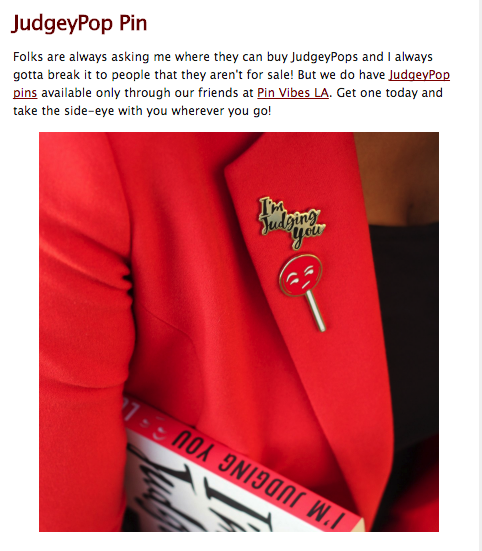
    A few weeks ago, the CEO of GMB Fitness, Andy Fossett, looked out at a crowd of marketers and said, “Don’t. ever. blast. your. list.”
    We all know this. But Andy’s eyes said what we were all thinking, “I cannot believe I still have to say this to a group of marketers. You people should know better.”
    And we should. “Blasting” your list is one of those foundational email marketing violations that can get you banished for life from advanced marketing circles. Other violations include: using the greeting “Hi Friend,” not segmenting your list, and “pushing” content to “get the word out.”
    Each of these violations makes up a core element of the infamous “Email Newsletter.” You might know them better as the things in your inbox you “Mark as read.”

    Click here to download our free beginner's guide to email marketing.

    Self-respecting email-marketers scoff at email newsletters.

    And yet…we’re seeing a resurgence of (dare I say it) GREAT email newsletters cropping up everywhere.

    If you don’t believe me, check your own inbox. How many of you look forward to Tim Ferriss’ 5-Bullet Friday (and copied it yourself with a not-so-clever, “Friday’s Top Hits” or some other knock off)? Or Austin Kleon’s famous “10 Things Worth Sharing” Newsletter. Or Ann Friedman’s “The Ann Friedman Weekly,” also sent on Fridays.
    Yeah, that’s what I thought. The newsletter is having it’s moment, which begs the question: Why on Earth are these working?!
    Every company with internet access has attempted the newsletter and failed miserably, boasting open rates that are lucky to hit 17%.
    The vast majority of newsletters get struck by the email-marketer’s-kiss-of-death: “Mark As Read.”
    What are these newsletters doing that’s making them work??
    I decided to investigate. Spoiler alert: the answers will (not) surprise you. In fact, they’re so #facepalm obvious you’re going to kick yourself for not seeing it. I certainly did.
    Here is why the email newsletters don’t suck and how you can make sure yours don’t either:

    💌 They’re super niche.

    If you work in a traditional company, odds are the email newsletter is your way of satisfying the CMO’s frantic need to “get the word out” whenever he randomly decides he needs to because he didn’t do the hard work of planning a proper launch or promotion strategy.
    That is the wrong way to do this.
    The right way is to focus exclusively on the kind of people who make up your specific audience and deliver content that only they will appreciate.
    Again for emphasis:
    Deliver content that only a specific audience will appreciate
    You don’t want everyone: just the right people. (Kinda like having product/market fit) This is why they don’t have to segment and can send ONE email to everyone. Their lists are niche and specific.
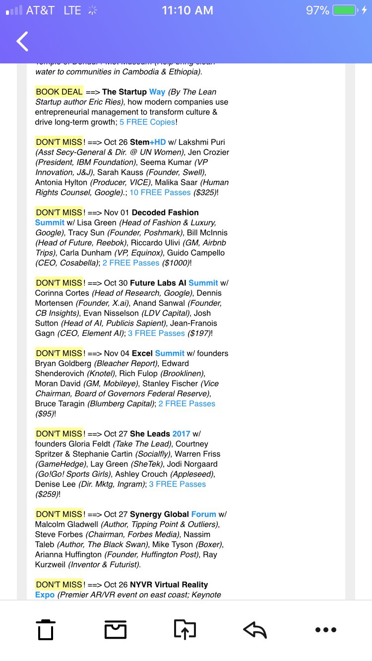
    My favorite example of this is Gary’s Guide -- a New York specific “digest” of what’s happening in the NYC tech scene. It has the most comprehensive list of events, classes, series A/B/Whatever funding updates, and job listings of anything on the internet. The best part? It looks like it hasn’t been updated since 1992.

    email-tg-01
    And, yet, it’s considered one of the best go-to sources for what’s happening in the NYC startup scene. That’s because it’s not trying to be everything to everyone.
    Gary’s Guide is just for startups and people wanting to break into the tech scene in Manhattan. In other words: It’s niche AF.
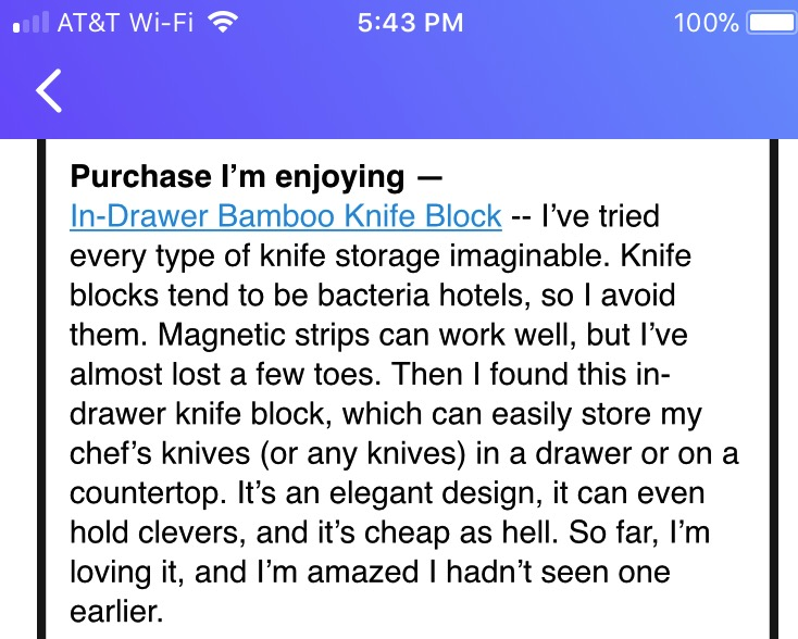
    Tim Ferriss is also very niche, despite his famously massive subscriber numbers. His audience is made up of bio-hackers and aspiring digital nomads and Tim delivers exactly what they want: latest “hacks,” supplements, gadgets, and, of course, stoicism!!! It’s got wonderfully nerdy book and documentary recommendations too.
    If you’re not interested in those topics, you won’t appreciate his bullets:
    email-tg-02
    What’s more is these bullets feel personal (we’ll get to that in #3). Like he’s your friend telling you what he’s reading, watching, and listening to. His readers don’t even care that these are mostly affiliate links because it’s so relevant and valuable to them.
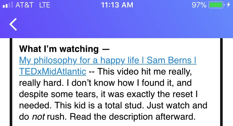
    Look:
    email-tg-03
    Again, this feels like he’s your friend, casually sending you an email. And it’s niche becuase he knows his readers are aspiring top performers and watching TED Talks at double speed, so he includes the detail, “Watch and do not rush.” It’s like he’s looking out for you.
    These newsletters work because they cater to a small, specific group of people. Tim and Gary are not trying to please everyone -- in fact, they’re actively trying to turn people off.
    For example, if you get excited from reading this article and subscribe to the newsletters I’m profiling here, you’ll likely be disappointed because they’re not interested in pleasing you. They’re interested in pleasing their people.

    💌 The content is actually good.

    I told you this would be obvious. You can’t skimp on this one and yet everyone tries to. That’s how “roundup” became such a dirty word. Paper.li, Refind, and other tools started automating curation and sending you pure crap (or simply too much). Newsletters started white labeling those automation services and claiming they were “curating,” but that is not curating.
    Curating is hand picking. If you’re the curator of an art gallery you’re not going, “Eh f*ck it,” and just slapping something random on the wall to meet your weekly quota.
    To curate is to be discerning. Careful. Methodical. Thoughtful.

    email-tg-04
    For example, this is a poorly curated photo. It makes no sense right here.
    Austin Kleon is the master of this. His links are thoughtful and relevant. You can tell he’s actually read what he recommends and isn’t siphoning the hard work of curation to his latest content manager hire (I’m assuming he has one, but you’d never know by reading the newsletter).
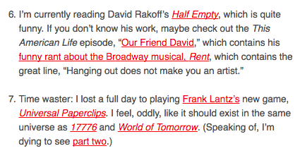
    Here’s an example of how he delivers quality curated content:

    email-tg-05
    This takes clickbait to a whole new level. Instead of using a baited headline, he hyperlinks the hook: “Which contains his funny rant about the Broadway musical, Rent.” Who doesn’t want to read that?!?! (ok unless you’re his niche, you probably don’t, but the point still stands)
    Kleon knows what his audience cares about because it’s what he cares about. He’s built a career and a brand around creativity and the arts. And funny drawings. And he delivers.
    To nail this requirement you need a deep understanding of your audience and what they care about.
    If you’re asking, “How am I supposed to know what people care about?” Do yourself a favor and get a degree in accounting and call it a day. I’m not sure you can be saved.
    TL;DR: Don’t be lazy. Your audience is trusting that you’re doing the hard work of finding the diamonds in the rough. And they will reward you by coming back, week after week.
    If you fail to deliver, (say it with me): “Mark as read.”

    💌 Context. Context. Context. And personality. But mostly context.

    Again, duh. But let me explain before you shut the screen cursing my name for telling you what you already know.
    The reason these “roundups” and “blasts” work is because they’re housed within useful context. They’re not actually a long list of boring headlines you skim.
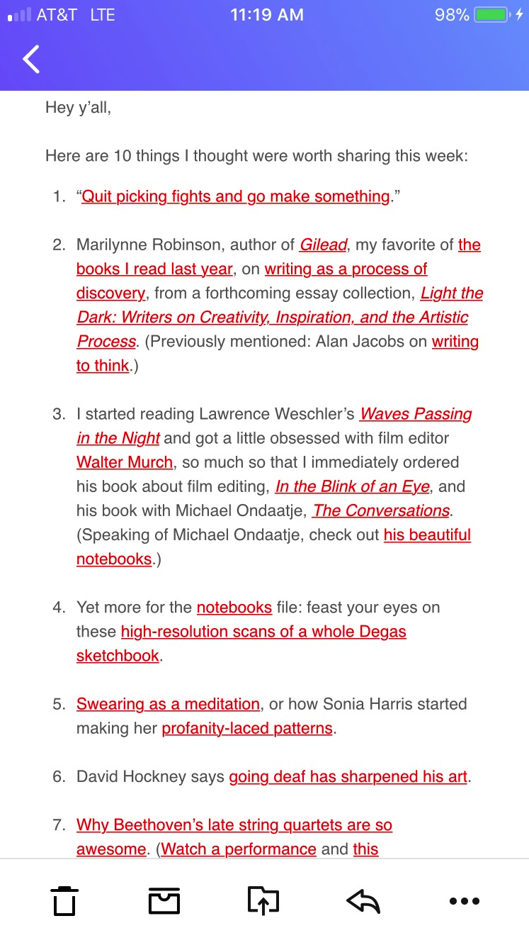
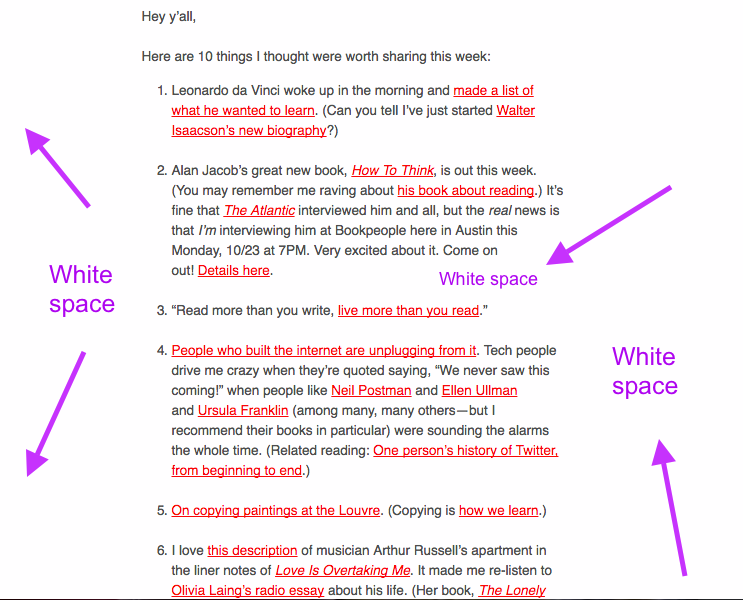
    Let’s break down a bit more how Kleon does it:

    email-tg-06
    1. It feels like he’s writing this directly to you (“Hey yall”). He’s conversational. Not overly chipper or super buttoned-up (here’s looking at you B2B).
    2. He doesn’t simply hyperlink the headline of an article and move on. He tells you why you should check it out or why he did. By hyperlinking the context he sort of gameifies the content. You don’t know what you’ll get until you click!
    3. He writes in the same pragmatic-and-hilarious tone he uses in his best-selling books (which is how most people discover him) which keeps his core audience happy and feeling connected to him (which is key!).
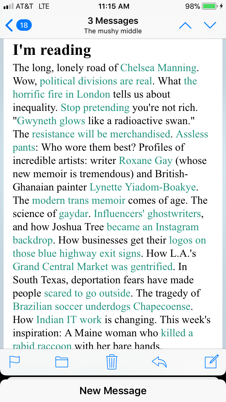
    Ann Friedman is also a master of this. Look how she weaves in a “roundup” of links into a paragraph of context (also a violation of copy-law: never publish a giant unbroken block of text!!!). Yet, she is famous for these giant blocks of relevant articles.
    Relevant to her readers. If you’re not a left-leaning progressive hungry for information on current events, women’s issues, race issues you probably won’t enjoy these pieces (see #1).

    email-tg-07
    She follows the same format as Kleon.
    She’s personable, relevant, and gamifying the hyperlinks inside of context. It feels like you’re getting a rant from your best friend.
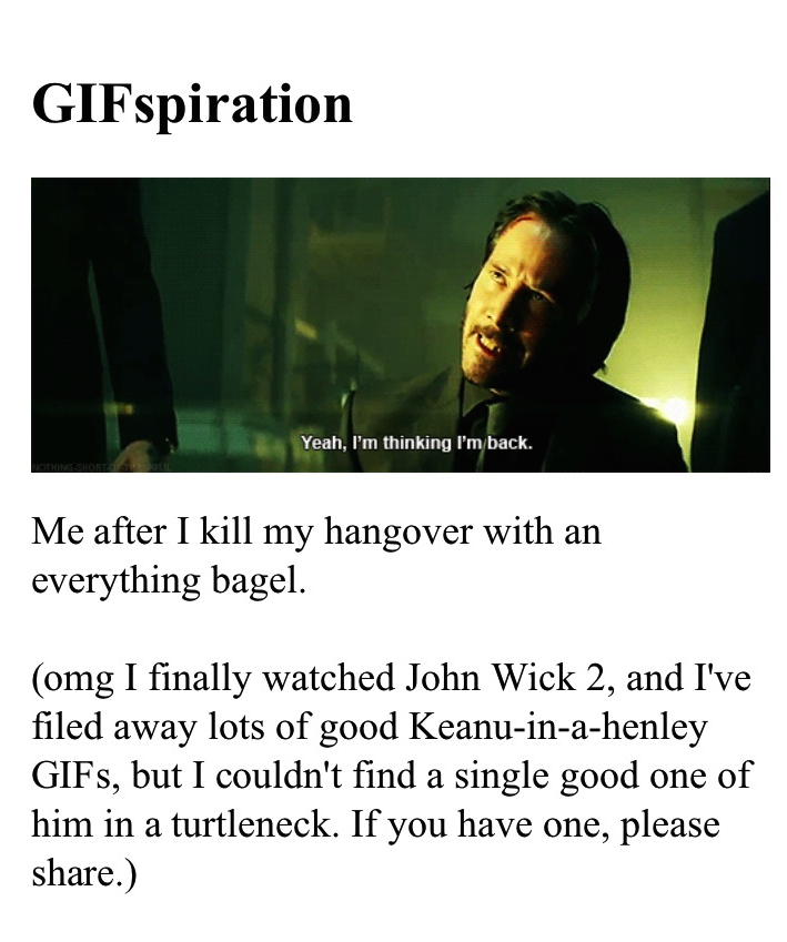
    Since that content can get pretty heavy, she does what your actual besties would do: add a hilarious inside-joke GIF.

    email-tg-08
    If you’re her market it’s funny.
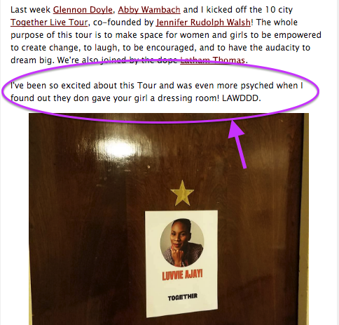
    Another master of the email-newsletter-blast-that-sounds-like-it-was-written-by-your-bestie is Luvvie Ajayi, famed blogger and NYT bestsellerwho writes the LuvvLetter. Read this and tell me it doesn’t sound like it’s coming from your bffaeae updating you on her life:

    tg-email-09
    You can HEAR her saying this to you.
    These “blasts” don’t feel like blasts because they’re executed extremely well. They emphasize personality, casualness, and respect the rule of email that says it’s not just a one-way communication. These emails feel like 2-way conversations you’re having with friends updating you on their lives.

    💌 They don’t visually assault you.

    I’m the last person qualified to talk about design seeing as I’m a copy-centric bafoon who frequently ignores the value of good design (I have been proven wrong. many. many times), but here we are.
    Newsletters that look like you repurposed a template from MailChimp are part of why people don’t read them. (I know, I am sorry MailChimp. There was a time for those.)
    Design exists to serve content. Design showcases content, it is not the star.
    You should never say, “Wow, this was well formatted.” You should say, “Damn, I love reading this.”
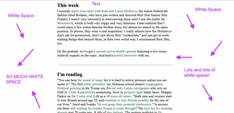
    Even Ann’s “giant block of text” is housed in a sea of whitespace so it’s not competing with colors and fonts and buttons and other noise.
    tg-email-10
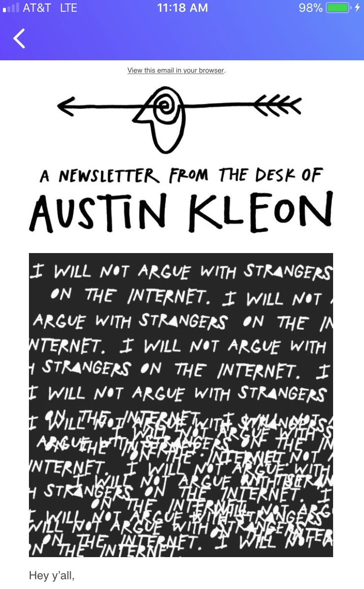
    Same with Austin Kleon’s:

    tg-email-11
    The banners are visually appealing too, without feeling like you’re getting a Well+Good digest (aka: digital newspaper…that’s a whole ‘nother post).

    tg-email-12
    Luvvie is also clean, despite having a lot more content than the other examples. Her newsletter doesn’t read like a digital newspaper bombarding you with stories. Her formatting is simple and (dare I say it) dated, but her audience doesn’t seem to care.
    These newsletters are consistent in that they showcase one content block at a time, making it easier on the reader to skim and get downloaded on the content they’re looking forward too (instead of being visually assaulted). Look how clean this is:

    tg-email-13

    This isn’t rocket science.

    …And yet the majority of marketing departments get it wrong. Newsletters are not a convenient tool for getting your company-specific information to your customers. They are a vehicle for communicating with your audience — just like all email is.
    Listen, I’m as shocked as anyone that one-way communication “blasts” are working, but they are. And after closely examining why, it turns out these newsletters aren’t *totally* violating email marketing laws since they’re upholding the important ones:
    • Don’t “throw” offers at people (don’t throw anything at people).
    • Act like a person. Don’t be weird (like overly chipper or too buttoned up).
    • Write to your readers, not your colleagues, your boss, or your phantom Gary Vaynerchuck.
    • Be divisive. Not the in Trump-V-Hilz way, but in the “this is for people like me” or “this is not for people like me” way. It should be clear immediately who your newsletter is for and who it’s not for.
    • Keep doing what works, stop doing what doesn’t.
    If we have any chance at clearing the internet (and certainly my inbox) of clutter, than we need to get this right. It’s not rocket science, but it does require some hard work and legitimate caring about your audience (I mean it. None of that pretending crap. Your readers always know).