A few weeks ago, the CEO of GMB Fitness, Andy Fossett, looked out at a crowd of marketers and said, “Don’t. ever. blast. your. list.”
We all know this. But Andy’s eyes said what we were all thinking, “I cannot believe I still have to say this to a group of marketers. You people should know better.”
And we should. “Blasting” your list is one of those foundational email marketing violations that can get you banished for life from advanced marketing circles. Other violations include: using the greeting “Hi Friend,” not segmenting your list, and “pushing” content to “get the word out.”
Each of these violations makes up a core element of the infamous “Email Newsletter.” You might know them better as the things in your inbox you “Mark as read.”
Click here to download our free beginner's guide to email marketing.
Self-respecting email-marketers scoff at email newsletters.
And yet…we’re seeing a resurgence of (dare I say it) GREAT email newsletters cropping up everywhere.
If you don’t believe me, check your own inbox. How many of you look forward to Tim Ferriss’ 5-Bullet Friday (and copied it yourself with a not-so-clever, “Friday’s Top Hits” or some other knock off)? Or Austin Kleon’s famous “10 Things Worth Sharing” Newsletter. Or Ann Friedman’s “The Ann Friedman Weekly,” also sent on Fridays.
Yeah, that’s what I thought. The newsletter is having it’s moment, which begs the question: Why on Earth are these working?!
Every company with internet access has attempted the newsletter and failed miserably, boasting open rates that are lucky to hit 17%.
The vast majority of newsletters get struck by the email-marketer’s-kiss-of-death: “Mark As Read.”
What are these newsletters doing that’s making them work??
I decided to investigate. Spoiler alert: the answers will (not) surprise you. In fact, they’re so #facepalm obvious you’re going to kick yourself for not seeing it. I certainly did.
Here is why the email newsletters don’t suck and how you can make sure yours don’t either:
💌 They’re super niche.
If you work in a traditional company, odds are the email newsletter is your way of satisfying the CMO’s frantic need to “get the word out” whenever he randomly decides he needs to because he didn’t do the hard work of planning a proper launch or promotion strategy.
That is the wrong way to do this.
The right way is to focus exclusively on the kind of people who make up your specific audience and deliver content that only they will appreciate.
Again for emphasis:
Deliver content that only a specific audience will appreciate
You don’t want everyone: just the right people. (Kinda like having product/market fit) This is why they don’t have to segment and can send ONE email to everyone. Their lists are niche and specific.
My favorite example of this is Gary’s Guide -- a New York specific “digest” of what’s happening in the NYC tech scene. It has the most comprehensive list of events, classes, series A/B/Whatever funding updates, and job listings of anything on the internet. The best part? It looks like it hasn’t been updated since 1992.
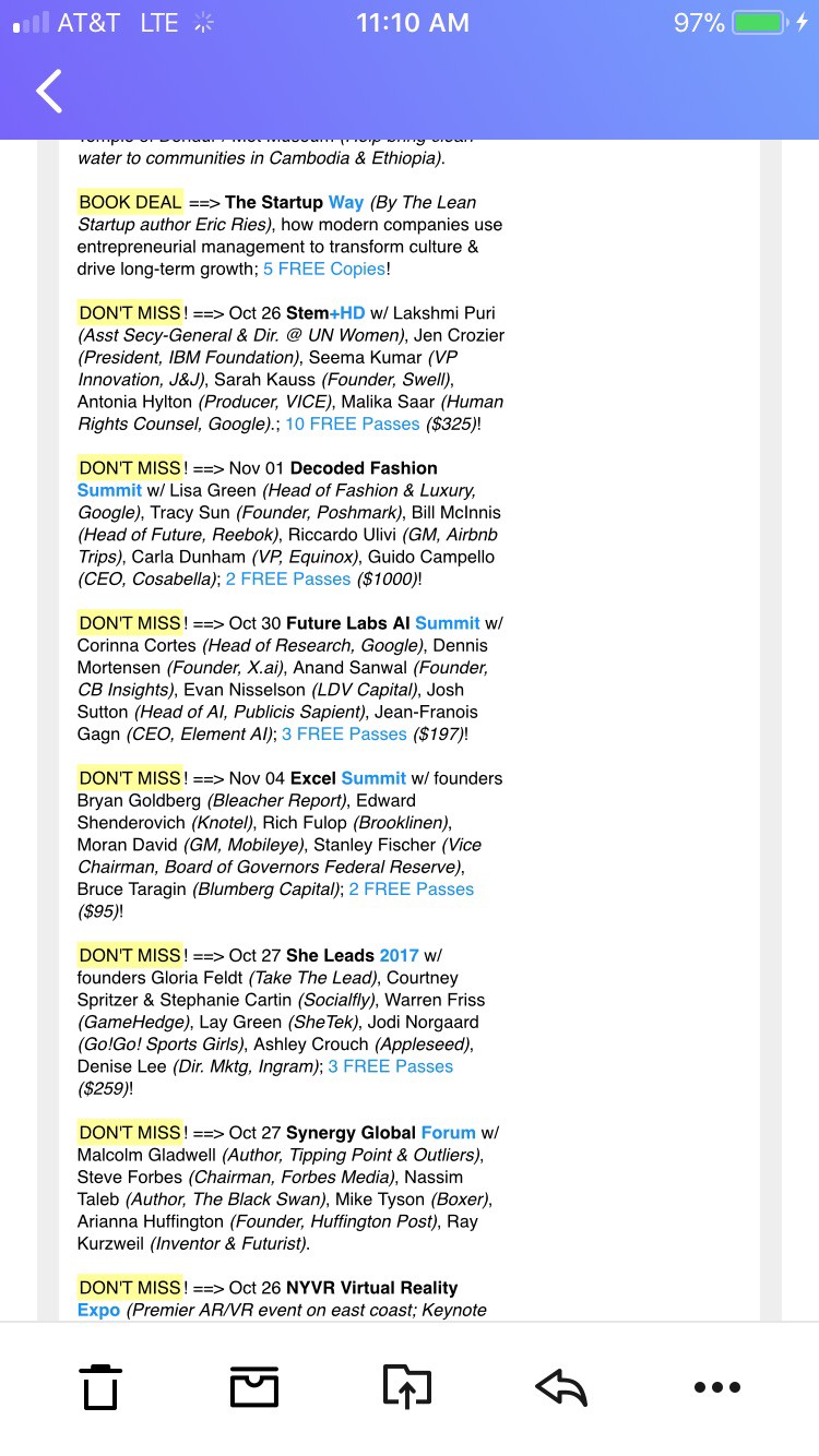
And, yet, it’s considered one of the best go-to sources for what’s happening in the NYC startup scene. That’s because it’s not trying to be everything to everyone.
Gary’s Guide is just for startups and people wanting to break into the tech scene in Manhattan. In other words: It’s niche AF.
Tim Ferriss is also very niche, despite his famously massive subscriber numbers. His audience is made up of bio-hackers and aspiring digital nomads and Tim delivers exactly what they want: latest “hacks,” supplements, gadgets, and, of course, stoicism!!! It’s got wonderfully nerdy book and documentary recommendations too.
If you’re not interested in those topics, you won’t appreciate his bullets:
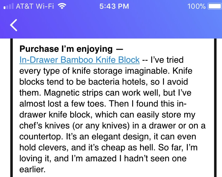
What’s more is these bullets feel personal (we’ll get to that in #3). Like he’s your friend telling you what he’s reading, watching, and listening to. His readers don’t even care that these are mostly affiliate links because it’s so relevant and valuable to them.
Look:
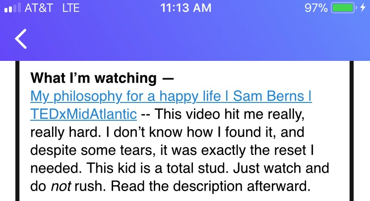
Again, this feels like he’s your friend, casually sending you an email. And it’s niche becuase he knows his readers are aspiring top performers and watching TED Talks at double speed, so he includes the detail, “Watch and do not rush.” It’s like he’s looking out for you.
These newsletters work because they cater to a small, specific group of people. Tim and Gary are not trying to please everyone -- in fact, they’re actively trying to turn people off.
For example, if you get excited from reading this article and subscribe to the newsletters I’m profiling here, you’ll likely be disappointed because they’re not interested in pleasing you. They’re interested in pleasing their people.
💌 The content is actually good.
I told you this would be obvious. You can’t skimp on this one and yet everyone tries to. That’s how “roundup” became such a dirty word. Paper.li, Refind, and other tools started automating curation and sending you pure crap (or simply too much). Newsletters started white labeling those automation services and claiming they were “curating,” but that is not curating.
Curating is hand picking. If you’re the curator of an art gallery you’re not going, “Eh f*ck it,” and just slapping something random on the wall to meet your weekly quota.
To curate is to be discerning. Careful. Methodical. Thoughtful.
For example, this is a poorly curated photo. It makes no sense right here.
Austin Kleon is the master of this. His links are thoughtful and relevant. You can tell he’s actually read what he recommends and isn’t siphoning the hard work of curation to his latest content manager hire (I’m assuming he has one, but you’d never know by reading the newsletter).
Here’s an example of how he delivers quality curated content:
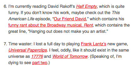
This takes clickbait to a whole new level. Instead of using a baited headline, he hyperlinks the hook: “Which contains his funny rant about the Broadway musical, Rent.” Who doesn’t want to read that?!?! (ok unless you’re his niche, you probably don’t, but the point still stands)
Kleon knows what his audience cares about because it’s what he cares about. He’s built a career and a brand around creativity and the arts. And funny drawings. And he delivers.
To nail this requirement you need a deep understanding of your audience and what they care about.
If you’re asking, “How am I supposed to know what people care about?” Do yourself a favor and get a degree in accounting and call it a day. I’m not sure you can be saved.
TL;DR: Don’t be lazy. Your audience is trusting that you’re doing the hard work of finding the diamonds in the rough. And they will reward you by coming back, week after week.
If you fail to deliver, (say it with me): “Mark as read.”
💌 Context. Context. Context. And personality. But mostly context.
Again, duh. But let me explain before you shut the screen cursing my name for telling you what you already know.
The reason these “roundups” and “blasts” work is because they’re housed within useful context. They’re not actually a long list of boring headlines you skim.
Let’s break down a bit more how Kleon does it:
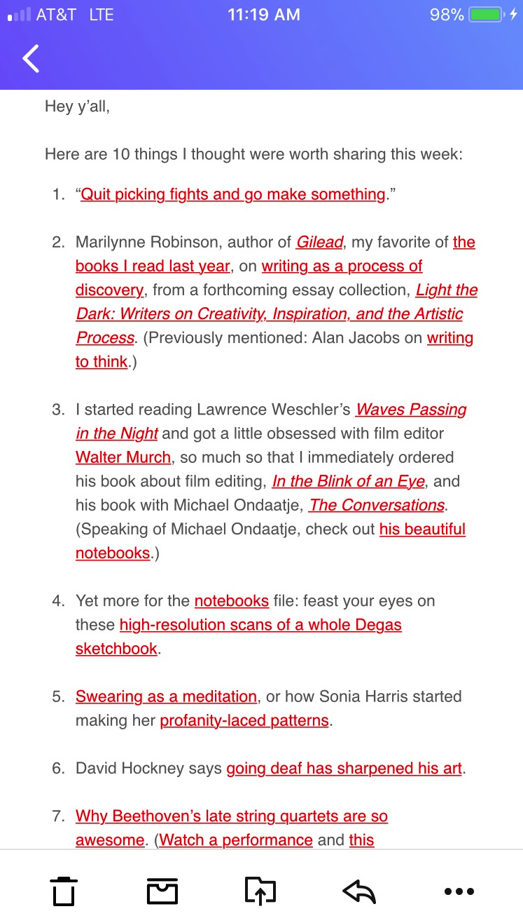
- It feels like he’s writing this directly to you (“Hey yall”). He’s conversational. Not overly chipper or super buttoned-up (here’s looking at you B2B).
- He doesn’t simply hyperlink the headline of an article and move on. He tells you why you should check it out or why he did. By hyperlinking the context he sort of gameifies the content. You don’t know what you’ll get until you click!
- He writes in the same pragmatic-and-hilarious tone he uses in his best-selling books (which is how most people discover him) which keeps his core audience happy and feeling connected to him (which is key!).
Ann Friedman is also a master of this. Look how she weaves in a “roundup” of links into a paragraph of context (also a violation of copy-law: never publish a giant unbroken block of text!!!). Yet, she is famous for these giant blocks of relevant articles.
Relevant to her readers. If you’re not a left-leaning progressive hungry for information on current events, women’s issues, race issues you probably won’t enjoy these pieces (see #1).
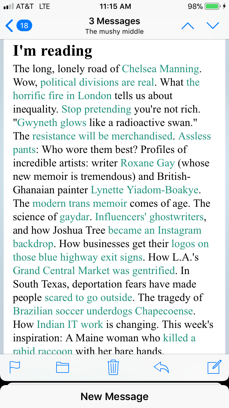
She follows the same format as Kleon.
She’s personable, relevant, and gamifying the hyperlinks inside of context. It feels like you’re getting a rant from your best friend.
Since that content can get pretty heavy, she does what your actual besties would do: add a hilarious inside-joke GIF.
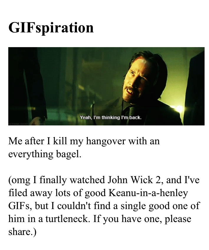
If you’re her market it’s funny.
Another master of the email-newsletter-blast-that-sounds-like-it-was-written-by-your-bestie is Luvvie Ajayi, famed blogger and NYT bestsellerwho writes the LuvvLetter. Read this and tell me it doesn’t sound like it’s coming from your bffaeae updating you on her life:
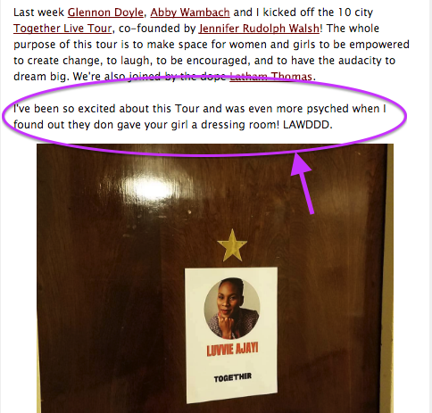
You can HEAR her saying this to you.
These “blasts” don’t feel like blasts because they’re executed extremely well. They emphasize personality, casualness, and respect the rule of email that says it’s not just a one-way communication. These emails feel like 2-way conversations you’re having with friends updating you on their lives.
💌 They don’t visually assault you.
I’m the last person qualified to talk about design seeing as I’m a copy-centric bafoon who frequently ignores the value of good design (I have been proven wrong. many. many times), but here we are.
Newsletters that look like you repurposed a template from MailChimp are part of why people don’t read them. (I know, I am sorry MailChimp. There was a time for those.)
Design exists to serve content. Design showcases content, it is not the star.
You should never say, “Wow, this was well formatted.” You should say, “Damn, I love reading this.”
Even Ann’s “giant block of text” is housed in a sea of whitespace so it’s not competing with colors and fonts and buttons and other noise.
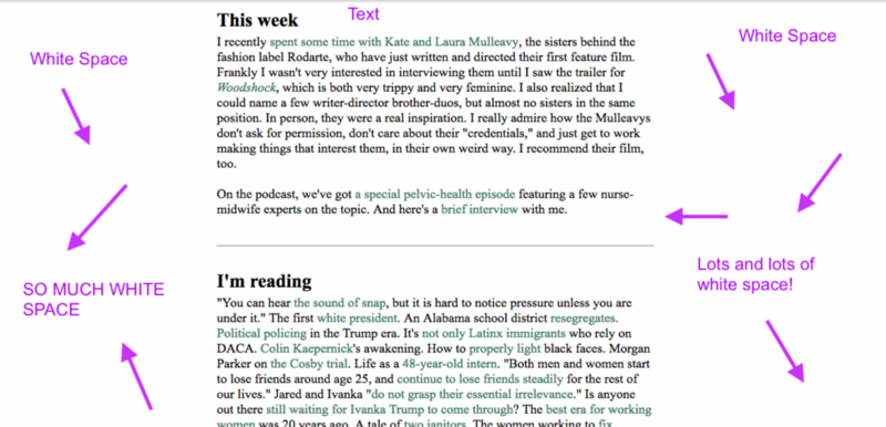
Same with Austin Kleon’s:
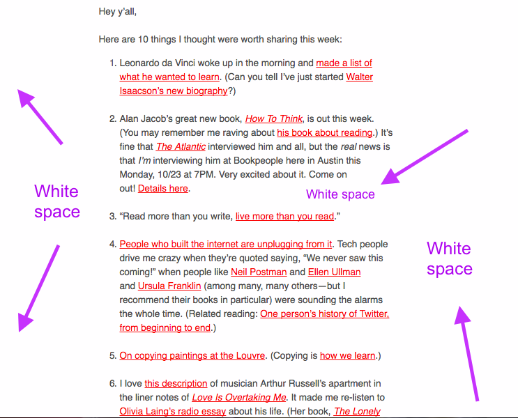
The banners are visually appealing too, without feeling like you’re getting a Well+Good digest (aka: digital newspaper…that’s a whole ‘nother post).
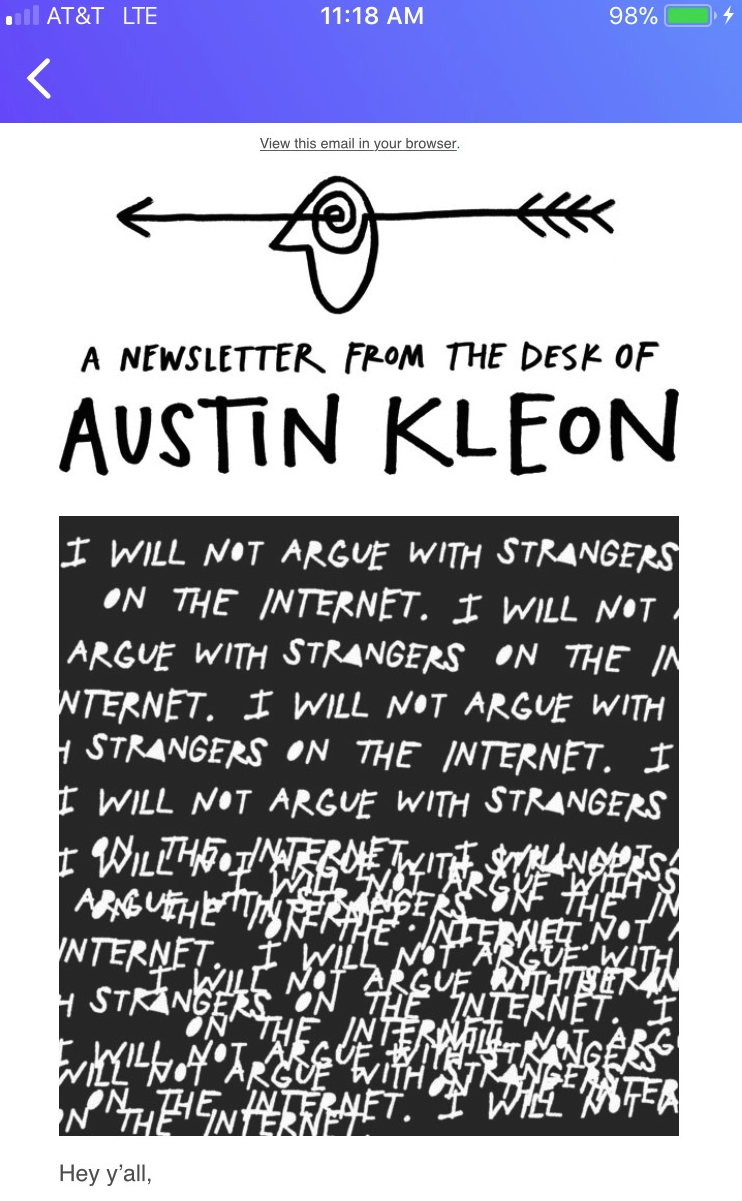
Luvvie is also clean, despite having a lot more content than the other examples. Her newsletter doesn’t read like a digital newspaper bombarding you with stories. Her formatting is simple and (dare I say it) dated, but her audience doesn’t seem to care.
These newsletters are consistent in that they showcase one content block at a time, making it easier on the reader to skim and get downloaded on the content they’re looking forward too (instead of being visually assaulted). Look how clean this is:
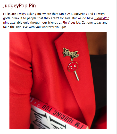
This isn’t rocket science.
…And yet the majority of marketing departments get it wrong. Newsletters are not a convenient tool for getting your company-specific information to your customers. They are a vehicle for communicating with your audience — just like all email is.
Listen, I’m as shocked as anyone that one-way communication “blasts” are working, but they are. And after closely examining why, it turns out these newsletters aren’t *totally* violating email marketing laws since they’re upholding the important ones:
- Don’t “throw” offers at people (don’t throw anything at people).
- Act like a person. Don’t be weird (like overly chipper or too buttoned up).
- Write to your readers, not your colleagues, your boss, or your phantom Gary Vaynerchuck.
- Be divisive. Not the in Trump-V-Hilz way, but in the “this is for people like me” or “this is not for people like me” way. It should be clear immediately who your newsletter is for and who it’s not for.
- Keep doing what works, stop doing what doesn’t.
If we have any chance at clearing the internet (and certainly my inbox) of clutter, than we need to get this right. It’s not rocket science, but it does require some hard work and legitimate caring about your audience (I mean it. None of that pretending crap. Your readers always know).


with DmPro
ReplyDelete- Automate Outbound DMs
- Send Automated DM Responses
- Send Bulk DMs to Your Contacts
- Send & Receive DMs via Email
Watchthemlive
ReplyDelete. See exactly why your website visitors won’t convert. Spot any bugs, frustration points, and poor UX and then fix them to meet visitors’ expectations.
Great Channel bZdSport
ReplyDelete