The pride of the Wishpond Blog is our subscribers - all 18,124 of them, as of this morning.
This article will break down the five strategies we've used to get them:
- Personalized subscription
- Content upgrade
- Exit intent offer
- Email-gated general resource
- General subscribe scroll popup
All of these strategies can be done by your business as well. None of them are super complicated or require coding.
I'll tell you exactly why each one works and why you should be implementing them on your own blog.
Let's get into it..
List-Building Strategy #1: Personalized Subscription Ask
This is one I don't actually see very often on other blogs, which makes me super excited (I love doing things first). While it doesn't get a huge amount of engagement, it does create a bit off personality in each article and effectively uses the author bio for something more than just introduction.
Here’s what the personalized subscription ask looks like on the Wishpond blog:
 Why It works:
- It personalizes each piece of content that someone reads on our blog. The author’s name and headshot are right at the top of the article.
- It creates a bit of loyalty. If a reader sees that I’ve written an article (instead of Cara, Kevin, Nick or Bree - our other content creators) and they like it, they’ll be more interested in reading my next article.
- It makes the mailout personal as well, with the words “Get James Scherer to personally send you his new posts.” This is more effective as well, because each of our content creators does mail out the articles they write.
List-Building Strategy #2: Content Upgrade Prompt
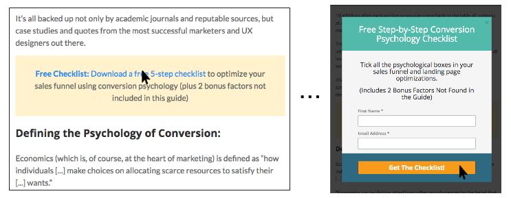
A content upgrade is “a lead generating incentive created to be given away on an individual blog post in return for a visitor’s email address.” (Source)
We’ve only started using them in the past month or two in our longer-form content. They have to be made specifically for the post they’re embedded in, and often provide bonus value or content related to the subject.
They’re great for eliciting a subscription, as you can be sure that your reader is interested in the exact subject they’re reading, and a content upgrade is simply more of that exact subject.
Here’s what a content upgrade looks like on the Wishpond blog:

And here’s a screenshot of our analytic platform, showing an article with a content upgrade converting 5.9% of readers into blog subscribers (more than 1000% better than our average):

And yes, that’s pretty typical of what we’ve been seeing.
Why It works:
- Content upgrades perform substantially better than a squeeze page for email-gated content (even 500% better) but are also more work to put together.
- They’re hyper-contextual, as they’re within the blog post, not at the bottom or top.
- They’re hyper-relevant, as their related directly to the subject of the blog post they’re in
- They’re hyper-valuable, as each content upgrade is exclusive to the post, and adds value to it)
- They’re click popups, so conversion is an optimized, single-step process (allowing you to subscribe and get your email-gated content without ever leaving the article)
For more on the power of content upgrades, check out my article “How we Used Content Upgrades to Increase Email Opt-ins 16x.”
List-Building Strategy #3: Exit Intent Offer
Exit intent offers are one of the most common blog subscription tactics, and we’ve actually replaced it in favor of the other four strategies in this article.
However, because it was such a huge part of our list growth between 2013 and this past summer, I owe it a piece of this article.
Here’s what the exit intent offer popup looked like on the Wishpond blog:
 Why It works:
- The exit-intent offer is your last chance to capture a prospective subscriber’s details, as it appears only when their cursor scrolls over the top pixel of your article’s page.
- The best part about the exit intent offer is that it can be used for multiple campaigns (not just blog subscription). We traded out the subscribe Ask for a webinar prompt many times over the past year or so.
- The exit popup has the highest view rate out of all of our list-building strategies (as it’s viewed by everybody who bounces from our blog). Because of this we can test designs confidently and quickly.
We’ve moved away from the exit popup not because it doesn’t work (it does) but because, since Wishpond became free a couple months ago, we use an exit popup to promote the platform instead.
List-Building Strategy #4: Email-gated Resource Landing Page
Ebook banners are probably (along with the scrolling form) the most common strategy for generating subscribers from blog content, and for a long time they (along with the exit intent offer) were our primary source.
If it weren't for content upgrades, they'd still be #1 on my list of strategies, as I like how genuine they are. They offer real value to readers and do so in a non-aggressive way. Like this article? Get the full guide to this subject in exchange for an email address. Simple.
Here’s what an email-gated resource banner looks like on the Wishpond blog:
And the corresponding landing page:

Why It works:
- Not every offer can be a content upgrade, and email-gated ebooks (or resources like them) are a great second option.
- They’re relatively simple to create and, as evergreen content, last far longer than a content upgrade.
- Simply embed a linked image (or CTA banner) into the bottom of your blog article that sends people to an optimized landing pages with an email-gate between them and being able to access your ebook.
- Ebooks can be created from your existing blog content (so long as that content is themed). The most cost-effective strategy is to intentionally write 4-7 blog articles on the same subject and then re-format the content into a PDF.
For more on how to create an ebook (without hiring an expensive graphic designer) check out my “Ebook Design Kit for Marketers Who Can’t Design for S**T” as well as parts 2 and 3 in that series on building a landing page and promoting your ebook.
List-Building Strategy #5: General subscribe scroll form
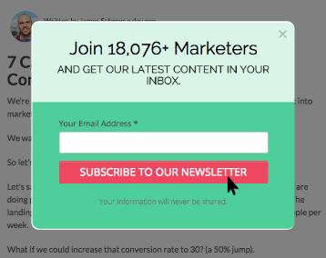
Almost every business blog you see has one of these, and they wouldn't be so ubiquitous if they weren't effective. They're understated and non-intrusive.
Here’s what a subscriber scroll form looks like on the Wishpond blog:

Why It works:
- A scroll popup is a great way to ensure your lead subscribes if they want to while reading your content, and only after they’ve read at least 50% of the article (so there’s value there).
- That said, because there’s no distinct offer involved (apart from the inherent value of the article they’re reading) we’ve made our scroll popup appear only once a week.
- We’ve also made this popup appear in the right margin of the screen, so it doesn’t impede our blog visitor’s ability to read.
- In fact, only the exit popup actually stops readers from getting the value of our content, and that only when they intend to leave anyway.
- The scroll popup also contrasts pretty loudly with the color scheme of our blog, to really grab the eye of our readers. The green box and red call to action are sure to be seen when they actually show up on the reader’s screen. If you’re lowering your popup frequency, be sure your popup is visible.
Conclusion
Hopefully these list-building strategies have given you a better understanding of how we use our blog content to generate emails and start relationships with our readers (and how you can do the same).
Remember to test your popup frequency carefully, and if you’re wondering about how to set any of this up just shoot me a comment!


No comments:
Post a Comment